Photography & Observation
Editing Fall Foliage Photos: A Simple Workflow
By Benjamin Janes · Published
· 6 min read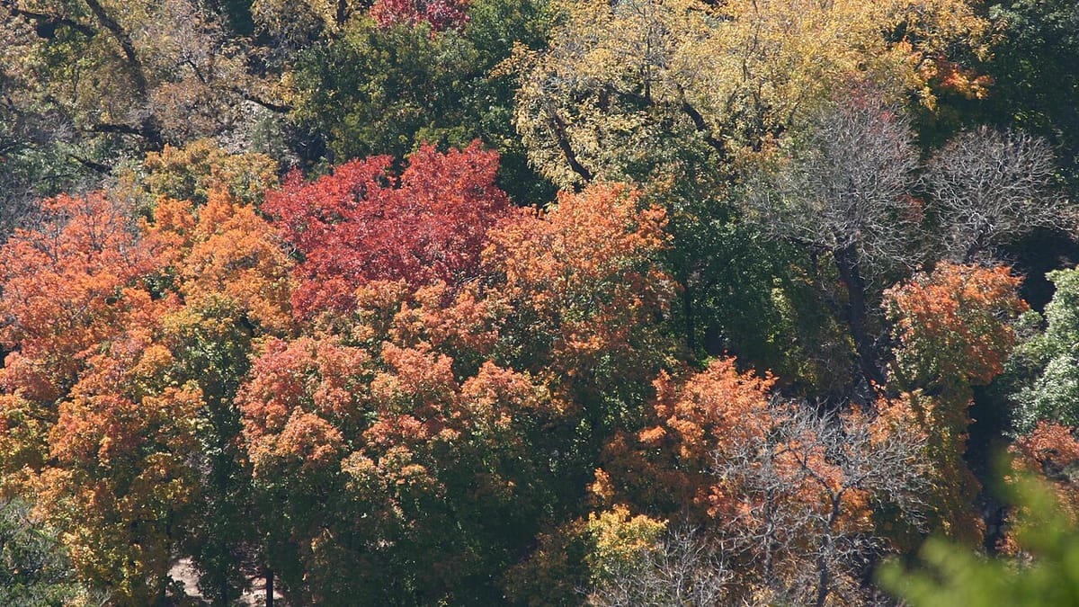
Good foliage editing does less than you'd think: fix the white balance, recover the sky, nudge contrast, and boost vibrance instead of saturation. Skip straight to maximum saturation and every red goes neon. Here's a short, repeatable pass that works the same way on a phone or a desktop editor.
Fix white balance before anything else
Start here, before touching exposure or color, because every later slider reads off whatever white balance you land on. Low autumn sun already casts a warm light, and a lot of cameras' auto white balance respond to a frame full of red and orange by cooling the image down to compensate, not warming it further. If a shot looks oddly blue or gray despite the color in front of you, nudge the temperature slider warmer until something neutral in the frame, a road, a rock, a gray sky, actually looks neutral.
The opposite problem shows up under a thick canopy or in open shade: light bouncing off surrounding leaves adds a real green cast, especially noticeable on skin and bark. Correct that with the tint slider toward magenta rather than fighting it with temperature, which only shifts an image warmer or cooler and can't touch the green-magenta axis a cast like this sits on. Get white balance right first and the rest of the edit goes faster.
Exposure: hold the sky, lift the shadows
Foliage scenes routinely pair a bright sky with a shaded, backlit understory in the same frame, more range than most sensors capture cleanly in one exposure. If the sky reads as a flat white blob, pull the highlights slider down until texture and a hint of blue come back. You're not trying to match a clear noon sky, just recovering detail that's genuinely there in the file.
Then check the leaves, especially anything backlit or sitting in a tree's own shadow. Lifting the shadows slider brings that detail up without disturbing the sky you already fixed, since most editors handle highlight and shadow recovery independently. Go halfway, then look again: a photo with visible detail from pure black to pure white usually reads flatter than one that keeps a little real shadow and a touch of blown highlight at the edges.
Add contrast without crushing the color
A small contrast boost is often the single most useful move in the whole edit, because color reads as more saturated when the tonal range around it is wider, without a saturation slider ever moving. Push it in small increments and stop as soon as shadow detail starts disappearing into solid black.
Watch the midtones specifically, since that's where bark, trunks, and any people in the frame live. Contrast pushed too far turns bark uniformly dark and collapses the color across a hillside into two or three blocky tones instead of a gradient. If your editor separates a midtone or "clarity" control from a straight contrast slider, a light touch there often does more useful work than either pushed to an extreme.
Vibrance, not saturation, is the whole game
This is the one habit that separates a foliage photo that looks like a memory from one that looks like a postcard rack at a gift shop. Saturation pushes every color in the frame up by the same amount, reds included, and reds are usually already close to a sensor's ceiling before you touch anything. Push global saturation and those reds clip into a flat, neon block with no gradation left, while skin tones and bark, never that saturated to start with, drift orange right alongside them.
Vibrance works differently. It boosts colors that are further from full saturation more than colors already near it, and it's built to leave skin tones largely alone. Reach for vibrance first, and treat saturation as a slider you touch by a point or two at the end, if at all.
A graduated sky and a small foliage-only boost
Global sliders treat the whole frame the same way, and a foliage scene rarely needs that. A graduated filter dragged down from the top of the frame, darkening just the sky, balances a shot better than another global exposure pass, since it targets exactly the part of the image that's usually too bright without touching the leaves below it.
The second local move worth learning: a small brush or radial adjustment with a modest saturation boost, applied only to the foliage itself, not the whole frame. This adds real punch to color that needs it, a shaded stand of maples, a foreground branch, without dragging bark, sky, or a face along for the ride. Keep the boost smaller than feels necessary. A local adjustment that reads as obviously edited once you zoom back out was pushed too far.
Why heavy HDR and neon color read as fake
Aggressive HDR processing and a maxed-out saturation slider chase the same illusion: more information, more color, more everything, all at once. The result is a photo where every part of the frame competes for attention and nothing gets to be the actual subject. Halos appear around branches where software fought two exposures together, and reds that would normally deepen and vary across a hillside sit instead at one flat, oversaturated value with no gradation, losing the subtle shift from crimson to rust that made the real tree worth photographing in the first place.
Edit toward what you saw, not a postcard
The best check on any of this is memory, not a slider position. Before you finish an edit, stop and ask whether the photo matches what you actually stood there and looked at, not a more impressive version of it. If a maple looked deep red-orange in person and the edited photo shows something closer to a stop sign, you've gone too far, whatever the histogram says.
That test holds whether you're a mile into a trail in Vermont or pulled over on a scenic byway in New Hampshire. A quiet, accurately warm stand of sugar maples tends to hold up better over time, and looks more credible than a version pushed to look like stock photography. Check the interactive foliage map before a trip to time your shoot for when a region's color is genuinely near its most vivid, since strong real color takes real pressure off the edit later.
Editing pass, in order
- Fix white balance: warm up blue shots, correct green cast with tint
- Recover the sky, lift backlit shadows
- Add a small global contrast boost
- Push vibrance, not saturation
- Graduated filter on the sky, small saturation boost only on the foliage
- Compare the result to what you actually remember seeing
Phone editing versus desktop: same order, different tools
None of this requires a desktop computer. A phone's built-in photo editor now includes white balance, highlight and shadow recovery, contrast, and separate vibrance and saturation sliders, along with basic local adjustment brushes, enough to run this entire pass without installing anything. The order matters more than the tool: white balance, then exposure, then contrast, then vibrance, then local touches, on a five-inch screen or a calibrated monitor alike.
Desktop editors in the Lightroom-style category add finer local adjustment tools, graduated and radial filters with more precise masking, and the ability to apply one edit across a whole shoot at once, actually useful after a two-hundred-photo hike. They don't change the underlying decisions, only how precisely you can execute them. Learn the order on your phone first; a bigger toolkit later just gives you a finer version of the same moves. For the shooting technique that gives this workflow good material to start with, our field guide to fall foliage photography and our notes on phone photography for fall color cover the camera side in more depth.
Frequently asked
- Should I fix white balance or exposure first when editing a fall photo?
- White balance first, always. Every later adjustment, contrast, vibrance, local color, reads off whatever white balance you land on, so fixing it last means redoing earlier work once the color shifts underneath it.
- Why do my edited fall photos look neon or fake?
- Almost always a global saturation slider pushed too far. Reds and oranges sit close to a sensor's maximum already, so boosting overall saturation clips them into a flat, uniform block instead of the graduated color a real leaf has. Vibrance, applied instead, avoids this.
- What's the actual difference between vibrance and saturation?
- Saturation raises every color in the frame by the same amount. Vibrance raises colors that are further from full saturation more than colors already near it, and it's built to leave skin tones mostly alone. For foliage, vibrance almost always gets you closer to a natural result.
- How do I fix a green color cast in shaded fall photos?
- Use the tint slider, not temperature. Temperature only shifts an image warmer or cooler; tint moves along the green-magenta axis, which is where a cast from light bouncing off surrounding leaves actually sits. Nudge it toward magenta until skin and bark look neutral again.
- Can I edit fall foliage photos well using only my phone?
- Yes. Built-in phone photo editors now include white balance, highlight and shadow recovery, contrast, and separate vibrance and saturation controls, along with basic local adjustment tools, enough to run this entire workflow without a desktop editor.
Regions in this article
More in Photography & Observation
Photography & Observation
Beyond the Postcard: Photographing Autumn's Small Details
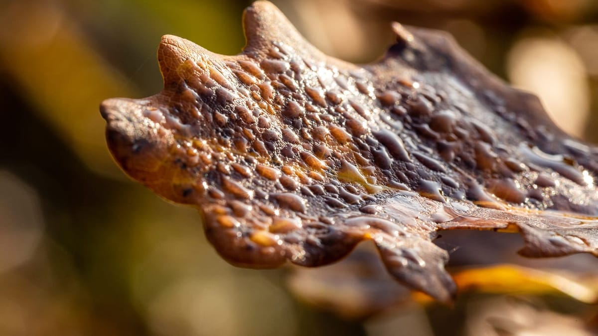
The wide hillside shot isn't the only one worth taking. How to photograph single backlit leaves, frost edges, tiny reflections, and the textures beneath the color.
2026-07-17 · 4 min read
Photography & Observation
Fall Foliage Photography: A Field Guide
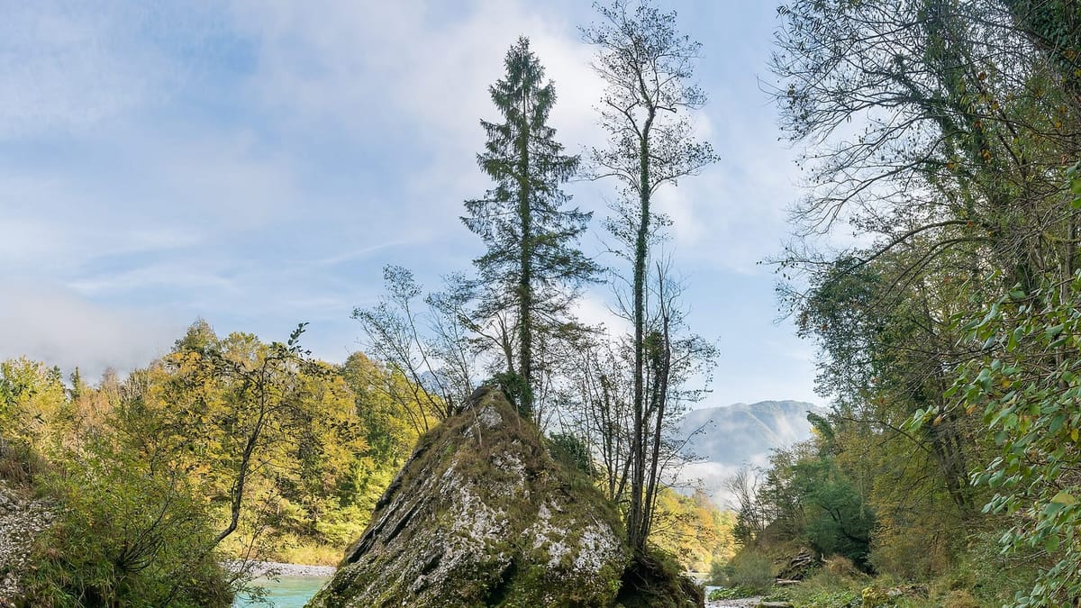
How to photograph fall foliage well: overcast versus golden hour, polarizer technique, backlighting, fog, water reflections, and phone camera tips that work.
2026-07-14 · 5 min read
Photography & Observation
How to Keep a Foliage Journal: Notes, Photos, and Phenology
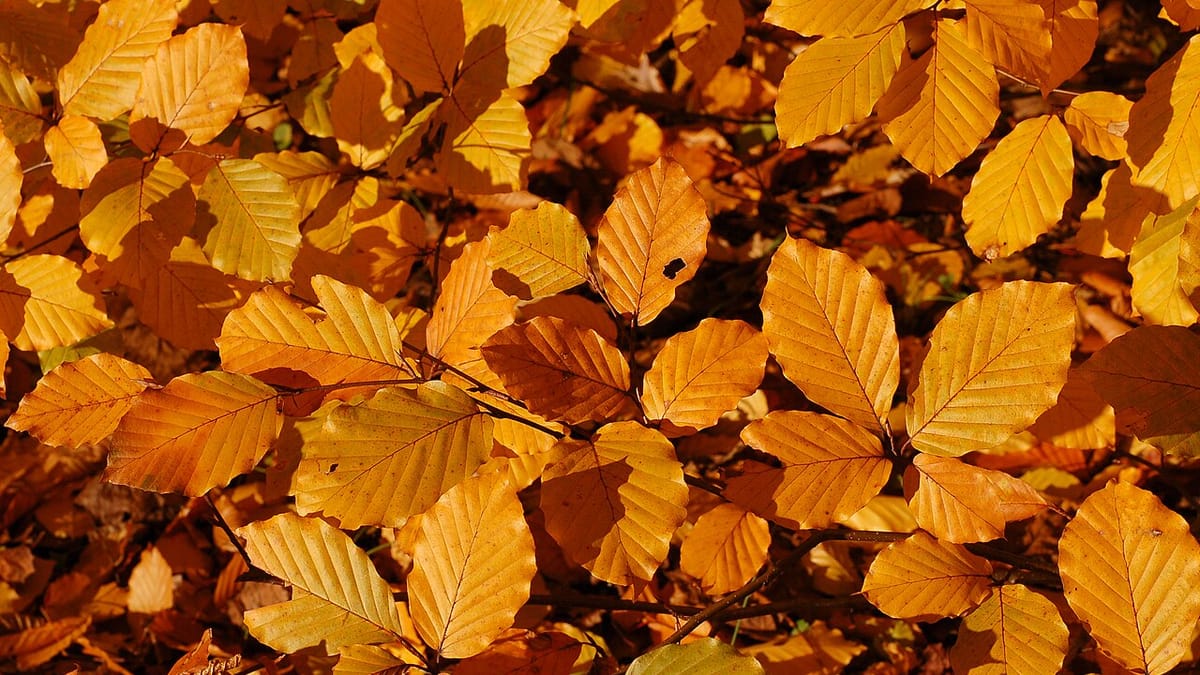
A short, consistent log of what a season really looked like beats memory every time. How to track color change and weather, and compare your notes year to year.
2026-07-17 · 5 min read